We are all familiar to new logo hoax stories ever since Gap announced that they had redesigned their logo. It’s still not clear if that was a cover up to try and disguise the fact that the ‘new’ logo was in fact awful.
Yesterday morning, the official Facebook page for Domino’s Pizza – New Zealand, posted this status with a photograph of a supposed redesigned logo which led many to believe that they may be trying to pull the same stunt as Gap:

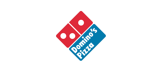
However, it seems that after reading this official press release that the new logo may be the real deal (2 for 1 anybody?). So what do you think? Here is the current ‘old’ logo on www.dominos.com that everyone is familiar with:

And here is the apparent new design again just for comparison:

Spot the difference
The biggest differences are that ‘Pizza’ has been dropped from the type completely and the familiar square icon now looks like your average domino mark. Though it could be argued that it looks like an open pizza box with hot food inside (that’s if you’re an optimist). The typeface has been changed and now has a rounder and plumper appearance to match that of the domino icon, though it looks awkward in terms of the layout of the mark and the type. One other thing to mention is that the domino mark has a TM Trademark symbol whilst the logotype has a ® Registered Trademark symbol which suggests that the logotype has been registered but the mark hasn’t or is currently going through the process? It seems like an odd way to announce something like this but I guess that is a sign of the times. It will be interesting to see how this (deep) pans out.


4:25 pm
7:33 am